PDP // Style Development- Nate Kitch

During my Empty Module, I had two main things I was focusing on. The first I did was to do Illustrations for a Children’s book which was quite neat and well polished, sticking to a certain style and using colours. The other however was a self exploration brief, aiming to push myself to create and illustrate in a different way other than just flat coloured drawings.

Prior to University, I classed myself as a traditional artist, favouring pen, pencil and paper mediums over digital ones, however in recent years have been working digitally without ever truely going back to my old roots of traditional. Therefore in this I wanted to go back to what I knew and loved, however within a new style and way, looking at illustration in more of a textured paper and collage view. This worked well however the illustrations I was creating looked too similar to the previous digital work, something which I wanted to stay away from.

Over the years I have found myself looking at multiple different illustrators, designers and creative people through Instagram and Twitter, mostly with a similar style to my own, However I decided to start to follow artists who worked in ways different to mine. I found artists looking through some peoples following lists, asking friends and even being recommended some by my tutors.
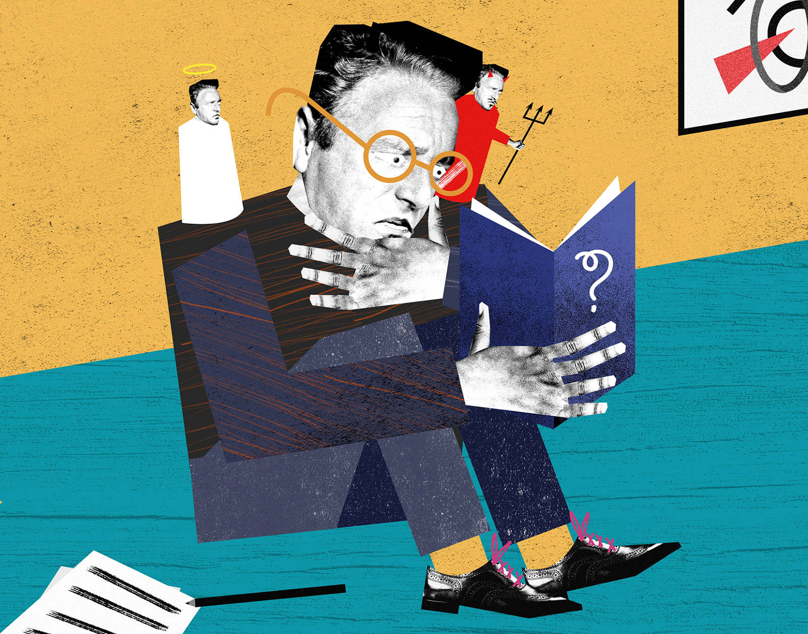
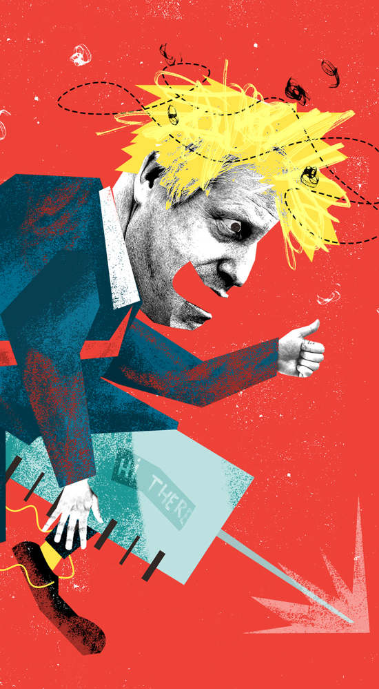
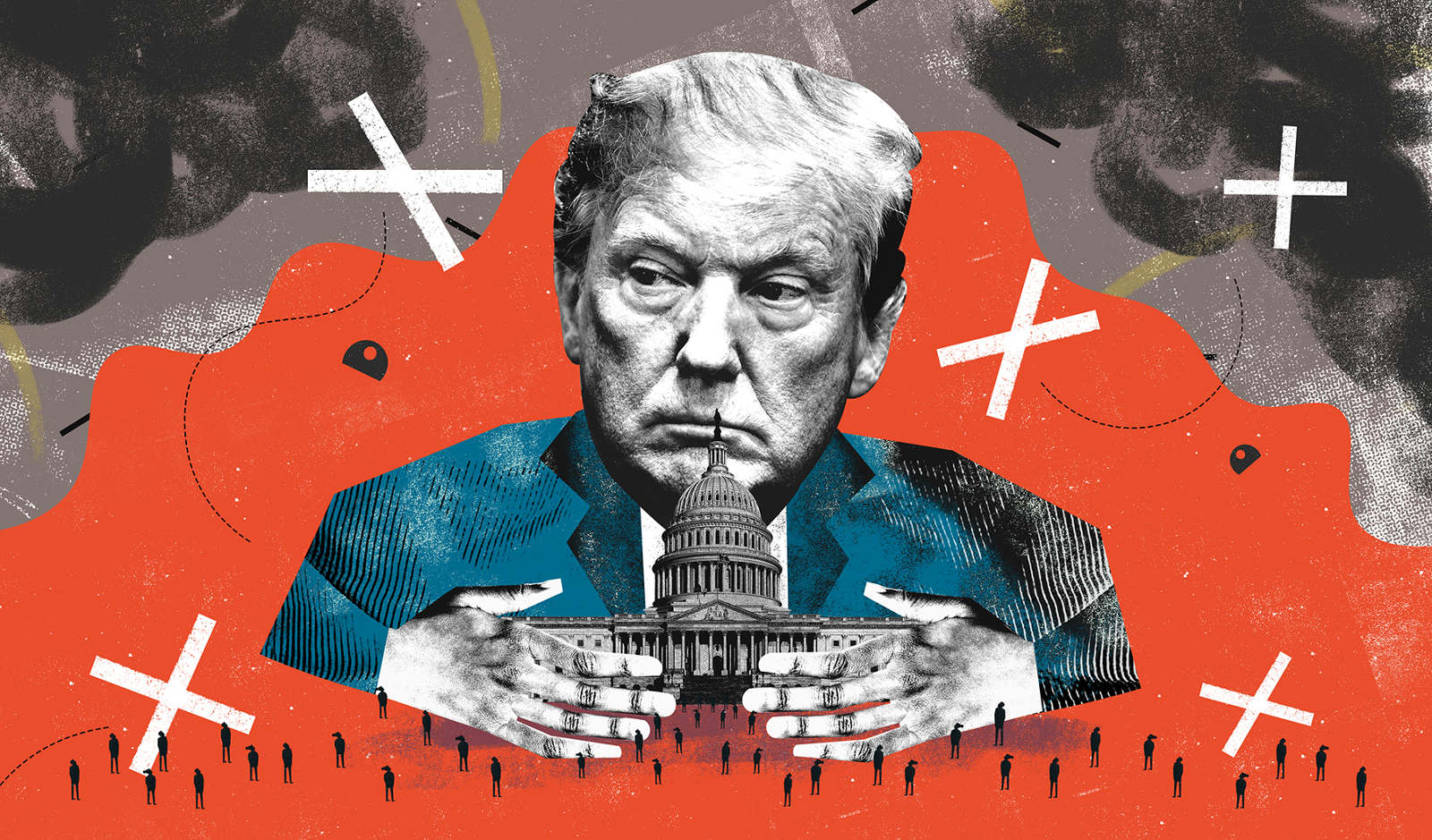
Nate Kitch was one of the names I had been told about countless times, however never fully looked at his work until I followed him. His work usually depicts something going on with the recent political news, done in a collage like way however digitalised, using scans of textures, ripped bits of paper, scans of text regarding the topic he is looking at, and using limited colours. These were all things that made him stand out as an artist and be perfect for me to take inspiration from.
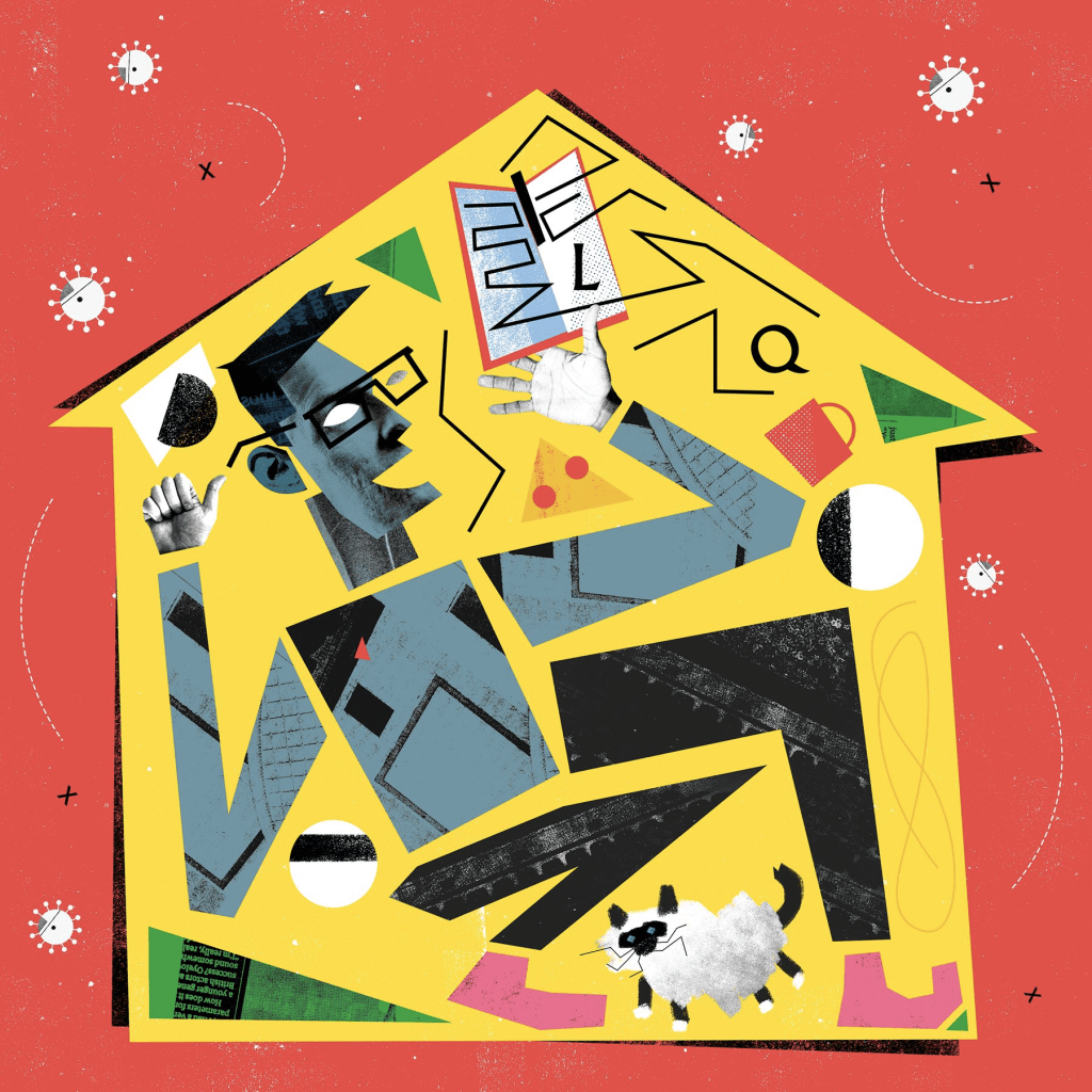
Looking at Nate Kitches work helped me take on some ways of illustrating things which I usually wouldnt think of, such as using the actual images of the people being depicted, and even use a different style of colour, with the added texture over the top.

PDP // Childrens Book Illustrations: Matildas Magical Kingdom

Whilst illustrating Matildas Magical Kingdom, I had looked at other pre excisting books which gave me some inspiration with the illustration style and placement with the text.

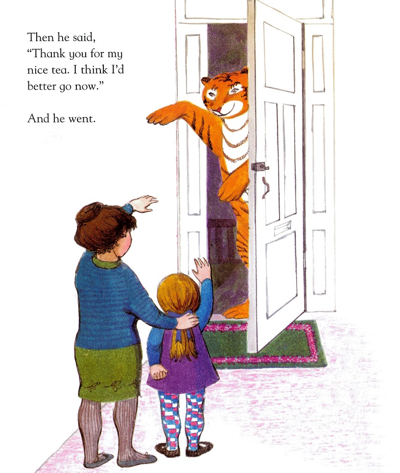
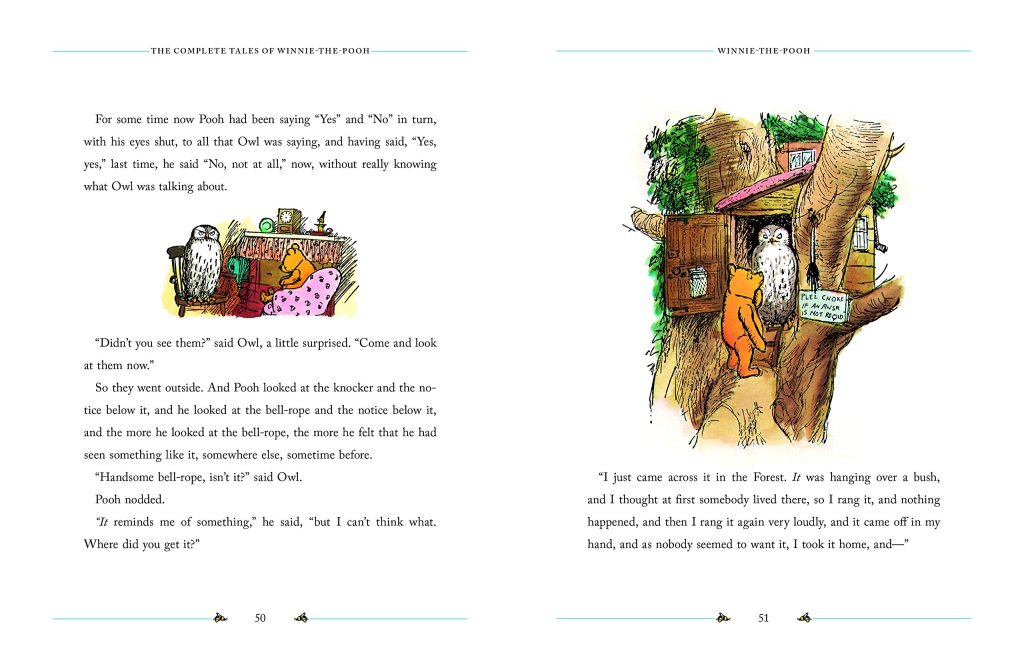
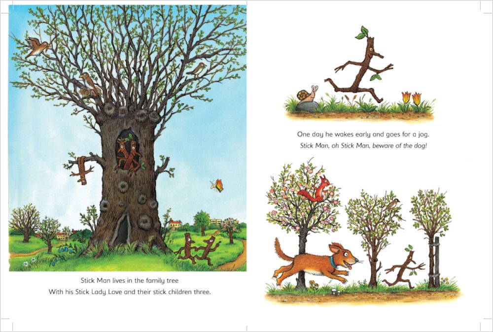
My initial thought was full page spreads of colour and illustration, however when looking at the text within the book, it was quite wordy and lengthy, which meant the text would not fit right around the illustrations. Whilst looking at some pre-exhisting books and illustrations I came across what is called Vignette Illustration. This was something I had been exposed to in the past without even realising what it was called. The look of a blurred off edge to the illustrations made it so they fit in with the text wherever and could even be done as smaller pieces fitting around the text.

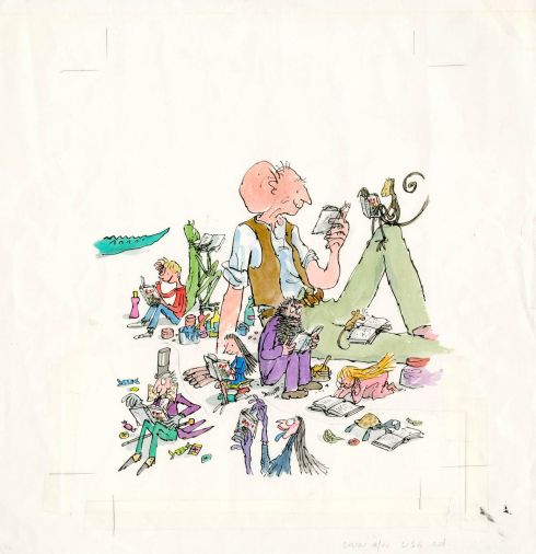
This has been done in the past in popular childrens books such as The Gruffalo, Stick Man, Winnie the pooh and The Tiger Who Came To Tea. This was also often used by Quentin Blake whilst illustrating for Roald Dahl.

PDP // D&AD: Chivas Regal

For my D&AD Project I decided to rebrand Chivas Regal. The brief of this was to rebrand Chivas Regal and future proof it for the next ‘generation of hustlers’. During this project I decided to research about the brand before redesigning it.

Chivas Regal is a Scottish Premium Whisky brand which was founded in 1786 and is one of the top 5 Whisky sold brands since 2016. The logo of Chivas Regal represents the Luckenbooth Brooch which is popular in Scotland as a love token, and was something I wanted to keep as a part of the brand, as The simple logo had a good meaning behind it.

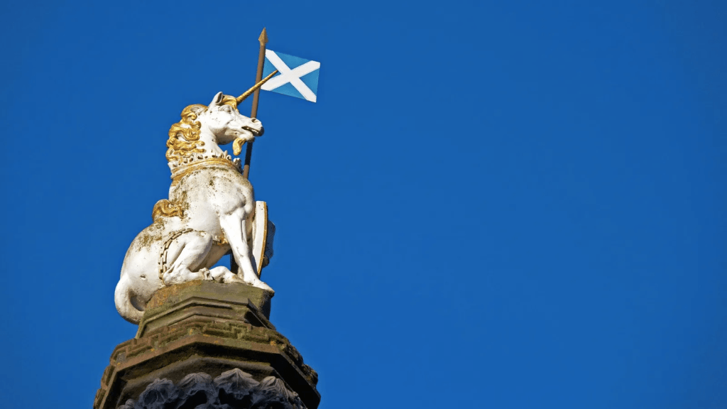
I decided to stick to the Scottish traditions and take inspiration from one of the popular Scottish landmarks, especially in the royal family, the Unicorn. This unicorn is usually seen with a crown around its Horn, however I did not want to tie the drink in with the Royal Family too much as this may not be popular or future proof with todays views. I placed the two unicorns facing each other on each side of the bottle in order to keep the symmetrical look of the previous ‘crest like’ logo from before.

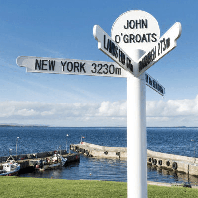
When trying to design this in my head, I had thought of the text and font, to a-company the illustration. When thinking of popular signage my mind immediately went to the sign post at John O Groats. This font was not public however It seemed very closely similar to Franklin Gothic. Using this font made for a hidden element which is still a close tie to Scottish culture and something which could stand out to the future generations as the sign has been to multiple places and also been there for multiple generations.

The Burgundy Red and Gold within the labels were kept as that gave quite a premium feel to the brand, however within the background of the Burgundy Red I added a subtle element of tartan, something which ties the whole Scottish culture and traditions together.

PDP // Zoom calls with Joanna and Matt

During this year we had some Zoom calls to people within design professions and practices to go over our Empty Module work and to get some outsider help and inspiration. My two calls were with Joanna Spicer, an ex-Stockport College student, now a tutor of Illustration at Cardiff Metropolitan University. As well as Matt Geeling the head of Animation at FuzzyDuck studio located in MediaCityUK in Manchester.

Speaking to Joanna, I didn’t have much time to explain all of my work, talking about both the Matilda’s Magical Kingdom illustrations I was doing, as well as the style development looking at News articles. During this time I had done more of the book illustrations than I had the news articles, and therefore spoke about children’s books. As Joanna has kids of her own it was nice to see the insight of a mother and their views when reading childrens books to her own kids. Jo spoke to me about the sizing of the book and mentioned how a lot of childrens books are a square shape or something close to. This was something I had noticed in the past and therefore agreed with. I had mentioned the Penguin Book Competition that I had done last year, and she brought up the Macmillan Artists book and how there was a template online to plan out the pages. Not long after our call she e-mailed me the template in hopes to help me.

Matt Geeling from Fuzzyduck answered the call by telling me that my previous Illustration Tutor James Condon would also be joining the call, as his plans had been canceled and as an ex tutor he thought it would be nice to catch up as he would have a better understanding of the stuff I was doing. This came at a bit of a hindrance however as when talking about my work, it seemed to be James answering a lot of the questions I was asking. I could see that on Matts webcam he seemed to be busy doing other things and had his microphone muted for most of the call. This was a shame as I also was under a time crunch to explain and show my work here, and meant that the majority of the feedback I got was from James. James did point out one thing I hadn’t noticed about my book Illustration work however, During the parts of the book that was seen from Matilda’s perspective, the colours seemed a lot more vibrant and stood out a lot more compared to the other parts of the book, which showed Matilda’s house and the world outside of her bedroom. This was something which wasn’t intentional however I agreed with and thought worked well as it helped play into the mind of an innocent young girl who liked colourful things.

These calls did help me slightly, but we’re not quite what I was expecting. I thought that both sides could help me a bit more than they did, as with this being something new to me, I would have liked a bit more professional level help. These calls did help highlight and make certain elements of my work stand out to me however and I am glad I had the talks with both Jo and Matt.

PDP // Uniqlo x Squidgame Idea: Squid Game

Being an Illustrator and Graphics Designer, I have always been told to keep up to date with popular topics and the news, in order to get the best idea of what people want and peoples views on current events. I tend to do this out of habit and almost accidentally sometimes, as I spend most of my free time on social media or binging Netflix or Youtube.

Whilst visiting my Girlfriends, we visited one of our friends who lives close by, and he asked us if we had watched the new Netflix original- Squid Game. Although I had heard of it, I was yet to watch it or even understand what it was about. After the first episode I was drawn in instantly and so was mostly everyone else on social media. Squid Game is a Korean show, where contestants are in to win 45.6 billion Won. This is done through a last man standing play style, with tasks which put you against your friends and make it easy to make enemies along the way, in a similar mindset of The Hunger Games.

After watching the entire show, I was really amazed at how different the show was, especially being Korean, some quirks of the show were unique to what we as a British audience would stand out and remember.

Along with my Idea of making clothes based on Uniqlo’s UT Collection line of clothing, I thought that the recent phenomenon that was Squid Game would be the perfect opportunity.

PDP // Uniqlo x Squidgame Idea: Uniqlo

As an artist, I like to explore art in many different ways, through multiple different media outlets and other such ways. I tend to surround myself with art as it will always keep me inspired to create. One of these ways is through the way I dress. I tend to wear a lot of ‘Graphic Print’ clothing with designs on from shows that I like to watch, to artists who I look up to and admire their work. Over the years of dressing in these ways I fell in love with the brand Uniqlo.

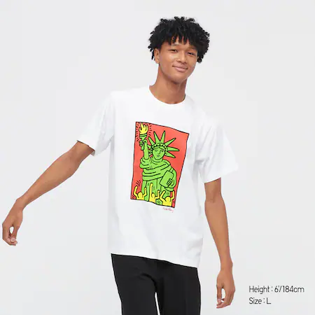
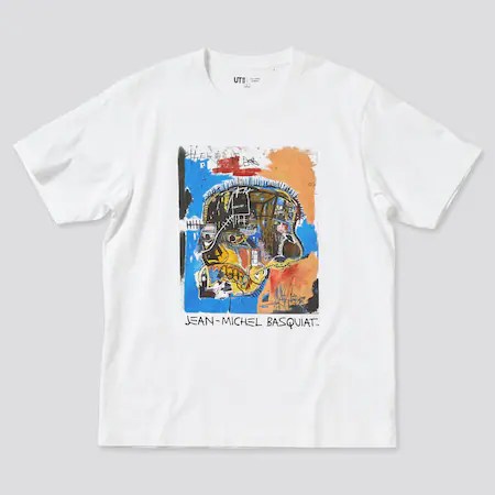
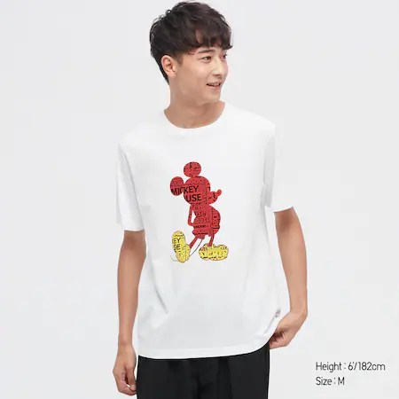
Uniqlo are a Japanese ‘casual wear’ design brand however they have a selection of apparel which is called ‘UT Graphic Prints’. This line of clothing is Uniqlos main line of graphics oriented clothing, and also one of their best selling. They have worked with brands such as Disney creating Mickey Mouse styled items, as well as other popular brands such as Hello Kitty, Pokemon and Sesame Street. Uniqlo also work closely with artists, such as KAWS, Jean-Michel Bisquiat, Keith Haring and even famous japanese artist Hokasai.

Not only does Uniqlo work with artists, they also focus on what is popular at the current time to make their designs based on and who to work with.

For the first Three week project we did I chose to design clothing as I wanted to focus on something I have a passion in as well as me being an artist, it felt right to use Uniqlo as the brand I looked at and got inspiration from.

Digital Platforms // Research

For my Digital Platforms brief, I made an Animation based off of Video Games, aiming to show facts and give a small insight of the history of videogames.

As I am a big fan of videogames myself and I studied Games Development at A-Level, I already knew some of these facts. These were pieces of infomation I already knew of, or was interested to find out. I tried to make the facts relate to eachother and have a common theme, such as ‘Most Sold Video Game’ and ‘Most Sold Video Game Console’ as well as ‘First Video Game’ and ‘First Video Game Console’/’First Handhdld Videogame Console’.

For these I searched myself for each answer. All of which I found on Wikipedia as it was a simple bit of information, with a one word or sentence answer rather than a vast explaination, which was good because it meant I could keep the Animation simple yet still factual.

These are the following links I uses for Research:

First Videogame Console: https://en.m.wikipedia.org/wiki/First_generation_of_video_game_consoles)

Most Sold Videogame: https://en.m.wikipedia.org/wiki/List_of_best-selling_video_games

Number of Home Video Game Consoles: https://en.m.wikipedia.org/wiki/Home_video_game_console

Video Game Genre Popularity: https://en.m.wikipedia.org/wiki/Video_game_genre

First Video Game: https://en.m.wikipedia.org/wiki/Early_history_of_video_games

Most Recognisable Character by Sales of Franchise: https://en.m.wikipedia.org/wiki/List_of_best-selling_video_game_franchises

Most Sold Video Game Console: https://en.m.wikipedia.org/wiki/List_of_best-selling_game_consoles

First Handheld Video Game Console: https://en.m.wikipedia.org/wiki/Handheld_game_console

Legend of Zelda: Breath of the Wild // Video Game

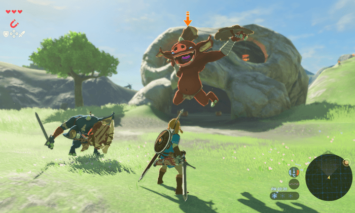
The Legend of Zelda series of video games have always been some of my favourite to play, however one of the most recent game on the Nintendo Switch was bigger and better than any of the others, with a vast open world, as well as stunning graphics with a cell shaded, semi realistic style. Showing a style that has never been done before.

One of my first thoughts when playing this game was how lovely the game looked. I’m not sure if that was down to me artistically thinking, so I just looked at it without thinking, but I had never seen another game like it. The models of everything; the weather and the sky. I thought the detail on every single part of the game was impressive to say the switch had only just come out, and saw a huge leap forward in Zelda games and animation and art styles and a brand new look of future gaming.

Above is an example of some of the older Zelda games, both on the Nintendo Wii. The First Image(Legend of Zelda: Twilight Princess) was a super dull game, with realistic tones and textures, where they were trying to experiment with what a ‘Realistic’ Zelda game should look like. However the second image (Legend of Zelda: Skyward Sword), a game which came out 5 years after Twilight Princess, was a huge upgrade, and was praised by many critics and fans for its lovely art style. However, I feel that Breath of the Wild is a game like no other, it combines both of these previous games and has a unique synergy of both styles, making it a beautiful game to look at. My eyes never got bored looking around at new stuff, which made me want to explore and go places I wouldn’t usually within the game- just to see what it looked like.

I would also like to mention some of the promotional art which was featured on many posters, magazines and stands within various shops, as well as on the box itself. These all have a digital feel, however it never looks flat or boring, they have textures and different shading and some form of looseness where the brush hasn’t quite fully ‘caught the page’ when being used.

Avatar: The Last Airbender // Animated Show

Avatar: The Last Airbender is a Nickelodeon Show, based in a world of Elemental Magic-Water,Earth,Fire and Air. With one who can control all four elements, in order to keep the Four Nations at peace. This shows how a young boy fulfilling his destiny of being the Avatar and saving the world, aswell as meeting new friends along the way.

I grew up watching Avatar, and always liked the concept of the story and the plot, however I had never watched it in its entirety. It was only until watching it back I realised how much I loved the art style as well as the characters and how they are portrayed, and animated. I have since watched this twice in full, as well as its spinoff/sequel The Legend of Korra, which shows the aftermath of Last Airbender. Due to the fact of me liking this show, I decided to buy the artbook, which shows some scenery and characters concepts, in depth and how they came about.

Design a site like this with WordPress.com
Get started