Spirited Away // Animated Film

Spirited Away is one of the most popular animated films, made by Studio Ghibli, a Japanese animation studio. Spirited Away follows a 10 year old girl moving to a new neighbourhood, however, during the move she enters the world of the spirits, where humans are not allowed. She must escape the spirit world to get both her parents and her life back.

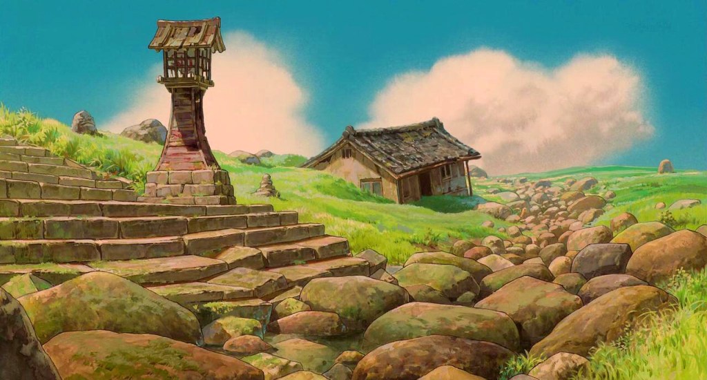
This whole aesthetic of the film is very heavily Japanese based, which I am also heavily influenced by. And therefore I am drawn to liking it more. It has some beautiful scenery, in the form of giant buildings and vast greenery landscapes. I enjoy the look of these as I am obsessed with the tiny detail that has been put into each shot and frame of this movie, with the eccentric Japanese buildings and architecture. I feel that you could pause the film at any point and get a beautiful, detailed frame of artwork.
As this film is both one of my favourites, and something which heavily inspires my work, and my craft, I have the official art book based on the film, which shows concept artwork, to scene planning, as well as a slight look of the 3D animation which is used in parts of the film. I love to look at the detailed fine-liner and watercolour concept work, as well as the final refined pieces done for the film.

Erika Artacuno // @artacuno

Artacuno is another instagram artist I follow, however, her style varies quite dramatically, and I like how she uses each medium slightly differently yet still to the point where you can tell the work is hers. Be it Pencil, Paint or Pen, I like how each piece is its own, usually with extensive backgrounds and a lot of action going on. It amazes me how she comes up with half of the ideas she thinks of, because I could never come up with half of the stuff she does. She is a huge inspiration within my artwork, and is at a level I wish to one day see my art alongside.

I really enjoy these clean, pen illustrations, as you can tell that there was a lot of thought behind each part of the piece, whether that be the positioning of things, the small hidden ‘easter eggs’ or just the use of perspective or hierarchy, outlining certain things slightly bolder than others.

However, not only does she do clean, neat pen pieces, she does slightly looser paintings with beautiful scenery and lighting. I tend to draw quite tight and usually on a smaller scale, however when looking at some of these bigger paintings, It makes me want to try bigger scale work, as well as getting back into painting myself.

Her pencil work is also similar to her painting work, sometimes larger in scale, as well as full scale pieces with backgrounds and brilliant lighting, with a lot of texture within them.

I am also a huge fan of her marker pen work, focusing on a colour and using that as the main subject of the piece. Just looking at these makes me want to experiment more with my own style and use mediums I would usually tend to stay away from.

Randy Chrisologo // @itsbirdy

Randy Chrisologo, better known as Birdy, is an illustrator and painter who specialises in drawing Pokemon and Mythical creatures. He uses Crayola Coloured Pencils and Biro pen, in order to create a lot of his work. This has inspired me to also use cheaper art supplies, as I feel that it is not about the materials used, but how you use them. The smooth colour lay down and texture he gets using a coloured pencil in this way makes his work stand out due to the vibrancy and almost Digital look to his colouring. This is something I would wish to hopefully some day be able to do as well.

However, he doesn’t only use coloured pencil, At University he studied painting. He usually tends to focus on landscapes and mythical places or beings within his paintings. His main choice when it comes to paint is Acrylic Paint, however has recently been venturing into Oil Painting.

His style varies from time to time, whether it be video game fan art, Mythical beast paintings, to sketches and portraiture as well as tattoo designs. All which are super in-depth, detailed pieces

Randy is the main reason I started my own art based Instagram. He was one of the first artists who I found on social media who’s interests were similar to mine, and looking at the work as a young teenager, it was something which I related to so much, I fell in love with his work almost instantly. Most people know his work from his Pokemon Onesie drawings, which was how I found him, however, as I have realised that his style is unique and its not just Pokemon and cartoon illustration, he has a lot more skills and talent among that.

Gabriel Picolo // @_picolo

Gabriel Picolo is a digital artist who draws for DC Comics. I find his art style unique because he can draw people and characters in his own unique and dynamic poses and settings. Each of his pieces have a lot going on, almost having a foreground, middle ground and background. His use of perspective allow the backgrounds to give the piece depth.

I like the way he shades his pieces, as it gives it a subtle shaded look, although certain parts are cell-shaded yet it doesn’t look flat or lack any kind of texture. I like that the shading and colours used effects the lighting in the image, giving it more of a sense of depth and reality. The muted tones and slight blue hues of the shading in the piece above make the blue Soda sign the main lighting.

Gabriel Picolo also did a 365 day drawing challenge from 2014 to 2015 which helped him improve his style and learn a lot about art during the challenge. This was not only what helped him develop his style and helped him improve in his skill, but also grew his Instagram which in turn allowed him to work for bigger brands and publishers, such as DC.

MMMMONEXX // @mmmmonexx

Mmmmonexx is an Instagram artist who specialises in drawing portraits. They use Black Biro pen to draw and sketch the portraits, as well as using Red Biro pen to add a duel exposure effect to the piece. This could be to show emotion or even to add more depth to the piece. I like these Biro sketches as they are stylised in a fashion which allows the pieces to look unique, and stand out against others, this is something which I would hope to one day get my art style like.

I wanted to show this within my Illuminate brief, as I thought that it would show a different side of the old woman I had drawn. I wanted to show the passing of time, and how the woman has aged, however I wasn’t sure how I would tackle this, so decided to do a test of this digitally, however I wasn’t pleased with the outcome.

Design a site like this with WordPress.com
Get started