For my D&AD Project I decided to rebrand Chivas Regal. The brief of this was to rebrand Chivas Regal and future proof it for the next ‘generation of hustlers’. During this project I decided to research about the brand before redesigning it.
Chivas Regal is a Scottish Premium Whisky brand which was founded in 1786 and is one of the top 5 Whisky sold brands since 2016. The logo of Chivas Regal represents the Luckenbooth Brooch which is popular in Scotland as a love token, and was something I wanted to keep as a part of the brand, as The simple logo had a good meaning behind it.
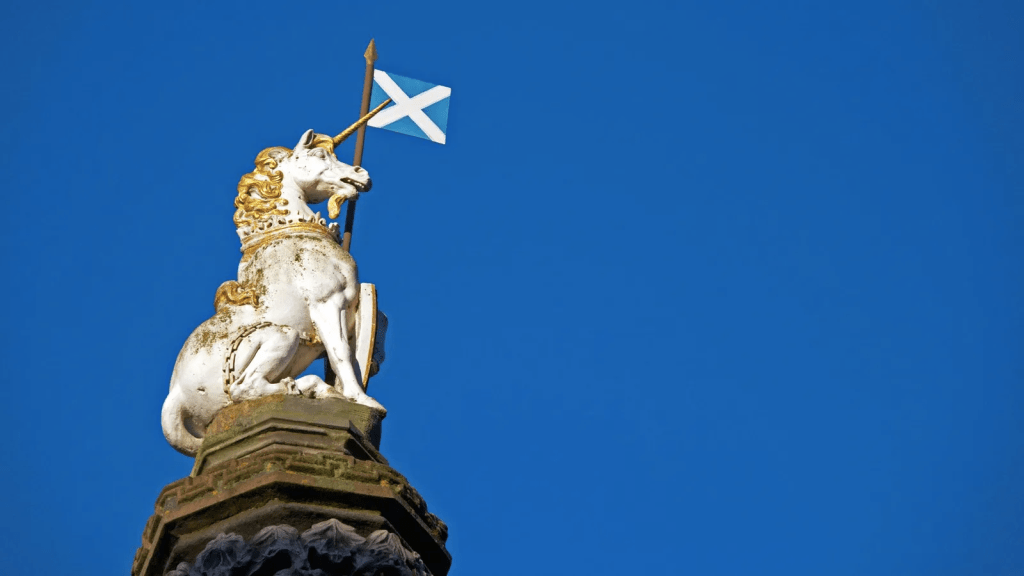
I decided to stick to the Scottish traditions and take inspiration from one of the popular Scottish landmarks, especially in the royal family, the Unicorn. This unicorn is usually seen with a crown around its Horn, however I did not want to tie the drink in with the Royal Family too much as this may not be popular or future proof with todays views. I placed the two unicorns facing each other on each side of the bottle in order to keep the symmetrical look of the previous ‘crest like’ logo from before.
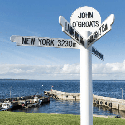
When trying to design this in my head, I had thought of the text and font, to a-company the illustration. When thinking of popular signage my mind immediately went to the sign post at John O Groats. This font was not public however It seemed very closely similar to Franklin Gothic. Using this font made for a hidden element which is still a close tie to Scottish culture and something which could stand out to the future generations as the sign has been to multiple places and also been there for multiple generations.
The Burgundy Red and Gold within the labels were kept as that gave quite a premium feel to the brand, however within the background of the Burgundy Red I added a subtle element of tartan, something which ties the whole Scottish culture and traditions together.
 Adam Renshaw PDP